New Google Play Store has been under construction for a long time. It was last redesigned many years ago and still looks like when Google launched the original Material Design language. Some Reddit users already lobbied for a redesign two years ago, and it seems that Google is now finally in the process of bringing us just that. Thanks to the tipster, a completely redesigned web experience has been noticed that is much more in line with the Android app of the Play Store.
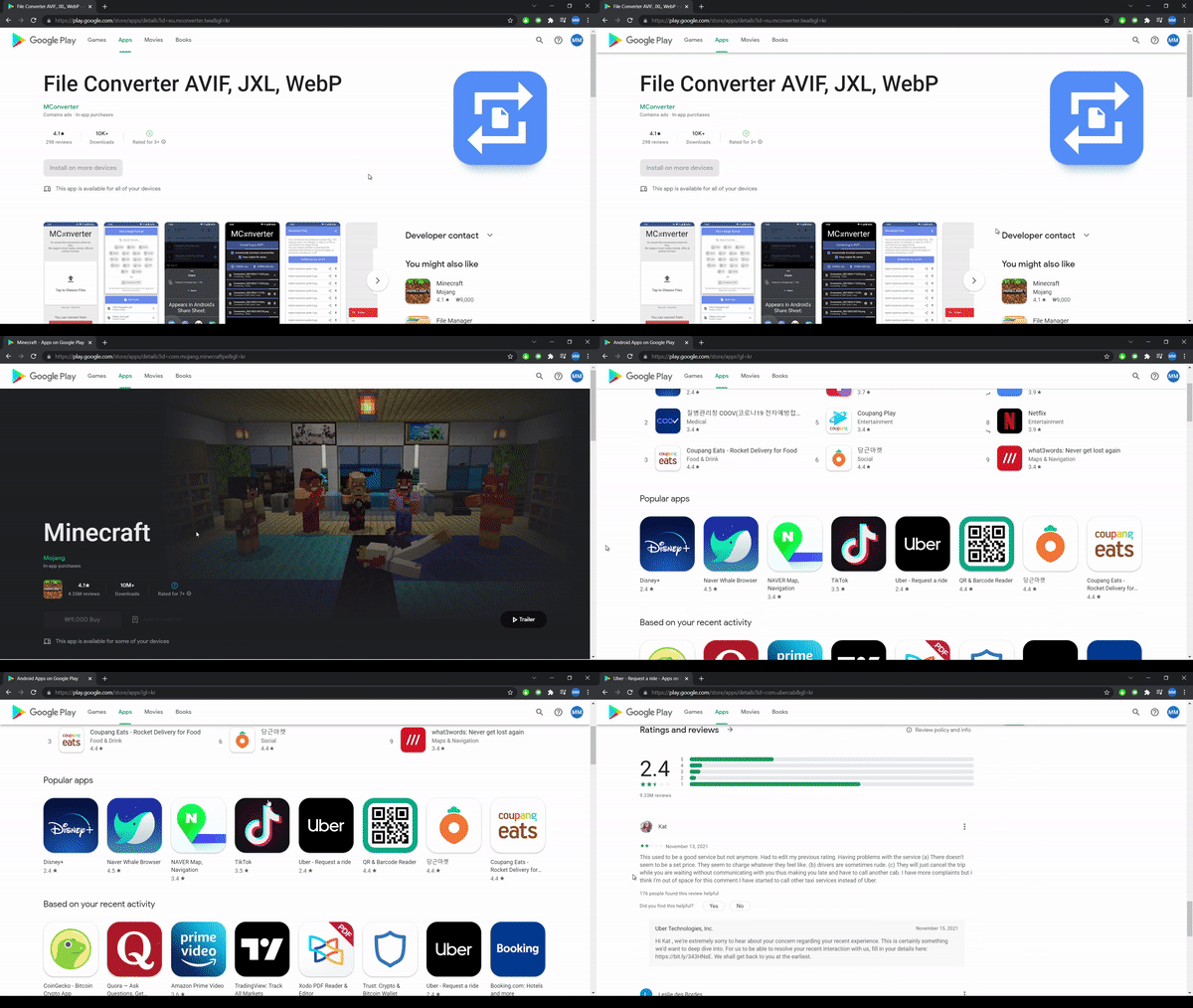
You’ll be forgiven if you mix up the new design with the Play Store app for Android at first glance, but it’s really almost identical to the UI. The Play Store logo is still in the upper left corner, but that’s about all that’s left the same, it reports Android police, with a large number of screenshots. The gray background and intricate, nested sidebar are gone, opening up space for a state-of-the-art navigation solution that gives you quick access to the four main sections of the Play Store: games, apps, movies, and books.

What is new in Google Play Store
When you peek into the apps or games section, you can filter by apps for your phone, tablet, TV, Chromebook, watch and car, which is incredibly valuable on the website – after all, you won’t be installing apps directly in your browser.
Things on the sidebar aligned on the left aren’t gone, don’t worry. Google has moved it to the account change location in the upper right corner, where you will now be able to access your library and your devices, subscriptions, payment methods, order history, your activity, rewards, settings, and more. It is questionable whether the removal of the sidebar makes the best use of the available space on the wide screens that we all have these days, but what is there.
On the individual pages of the application, the redesign really looks like an overblown mobile display. The huge title instantly lets you know which app you’re watching, along with an equally huge icon on the right. The right-aligned sidebar gives you options for developer contact and further app suggestions, while the rest of the interface is designed similarly to a mobile app, with download numbers, ratings, and age restrictions.

For games, it looks like there will be trailers with automatic play. The install button is just below, while the screenshots are positioned in the gallery that moves to the side next to it.
The search experience has also been updated. As with the app, you’ll get many more autocomplete recommendations when you start typing queries, and you’ll also have direct access to the app list when you enter a good enough name match. In that case, you will be redirected to a search page that gives you additional details about the result you were probably looking for, listing the other relevant apps in the carousel that moves horizontally. It’s not exactly the best way to take advantage of the big screen, but at least you won’t be overwhelmed by the huge number of results like in the past.
The redesign is still in progress, because some parts are completely broken. Not everyone is allowed to access their application library in a new redesign, and there are some visual inconsistencies, such as old UI elements that still pop up left and right in some application lists.
Although the Play Store seems just a little overblown on the desktop, the redesign is more than late. The interface seems to be much better at scaling for different window sizes, which was a sore point in the older version that doesn’t work well when viewed in narrow windows. It also seems that the store loads much faster than the older version, which is nice to see. And we can’t stress this enough – if you’ve ever used the Play Store app, and you have, you should feel at home. It’s just a shame that the new design is already on the verge of becoming obsolete again, given that the Play Store has moved on to the Material You theme, which isn’t active in any capacity in the web experience.
From what we can conclude, the redesign seems to take place on the server side. It remains to be seen whether Google will immediately expand the redesign or whether this is an a / b test that reaches a certain number of users at the same time. It remains for time to show.
More Google news: Google Maps gets a dark mode for iOS users
source: androidpolice